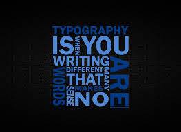
Optimize Mix and Match Typography in Web Design

Technology advancements has popularized a typography style in websites. The ability of selecting the appropriate font has broaden to the extreme to make websites attractive. Mix and Match typography has become the necessary features of web design for creating the best user experience. To improve the website look and feel in long run, selecting the right typographic plays the key role to leave viewers attractive. After years of working, many customers are focusing and pushing designers to go with mix and match typography style of usage in their websites.
With emergence of new trends popping up for better readability, there is raise in usage of usage of typography in web design. Most notably, retro typography on vintage style websites is quiet powerful across the web. This trend has been around for a while but now we are seeing this in full force for websites who want to set up their brand in bold and visually interesting ways. This Mix and Match typography relies on the designer’s ability to choose the right fonts to match not just the message, but the other typographic styles in use.
Some designers usually stick to one font to what they like, but it is good to mix and match fonts with the flow of website without effecting the overall look. Think of not to use too-small or too loopy fonts that are hard to read and look for long periods of time. Though there are several kinds of fonts available, look for the right mix and match typography that fits the mood and aesthetic of your design. Try out new things to achieve a desired effect for your website allowing viewers with maximum readability.

