How can I make Bootstrap columns all the same height?
By using the custom class row-eq-height in Bootstrap we can assign the same height as of the tallest column to all the columns.
You might have been surfing the web using your favorite browser? May be you spend a few minutes each day or you may be “hooked” and it takes ten elephants to take you away from your computer; I know, the web is really an interesting place.
To load a web page you just type the URL or select a link from your favorites or bookmarks, and hitthe Enter key and you are taken to a web page. You are not perturbed what goes behind the scene. But have you ever wondered how a web browser really works and how it displays the web page on your computer screen? If yes, I assure you it is going to be an interesting read.
The browsers we will talk about
A web browser, as we all probably know, is a computer program that displays web pages and websites. There are five major browsers used on desktop today: Chrome, Internet Explorer, Firefox, Safari and Opera. On mobile, the main browsers are Android Browser, iPhone, Opera Mini and Opera Mobile, and UC Browser – all of which, except for the Opera browsers, are based on WebKit. According to the StatCounter statistics (as of June 2013) Chrome, Firefox and Safari makes around 71% of global desktop browser usage. And on mobile, Android Browser, iPhone and Chrome constitute around 54% of usage. Web browsers are the most extensively used software today. Let us see how the browsers work behind the scenes.
The prime functionality of the browsers
The browsers main functionality is to present the web resource you choose, by requesting it from the server and displaying it on the browser window. The resource format is regularly an HTML document, but it may also be a PDF, image, or some other type of content. The location of the resource is specified by the user using a URI (Uniform Resource Identifier).
The way the browser represents and displays HTML files is specified in the HTML and CSS specifications. These specifications are managed by the W3C (World Wide Web Consortium) organization, which is the standard organization for the web. For many years browsers conformed to only a part of the specifications and developed their own extensions, which caused a serious compatibility issues for web authors.
Browser user interfaces have a lot in common with each other.
Amazingly enough, the browser’s user interface is not specified in any formal specification, it just comes from the good practices shaped over years of experience. The HTML5 specification doesn’t define the UI elements what a browser must have, but lists some common elements. Among those are the address bar, status bar, and tool bar. There are, of course, features unique to a specific browser like Firefox’s downloads manager.
The high level structure of the browser’s
The major components of the browser are:
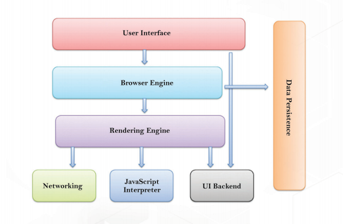
1. The User Interface: Includes the address bar, back and forward button, bookmarking menu, etc. Every part of the browser can be seen except the window where you see the requested page.
2. The Browser Engine: Marshals actions between the UI and the rendering engine.
3. The Rendering Engine: It is responsible for displaying requested content. For example if the requested content is HTML, the rendering engine parses HTML and CSS, and displays the parsed content on your screen.
4. Networking: It is used for networking calls, such as HTTP requests, it uses different implementations for different platform behind a platform-independent interface.
5. UI Backend: Used for drawing basic widgets like combo boxes and windows. This backend exposes a generic interface that is not platform specific. Beneath it uses operating system user interface methods.
6. JavaScript Interpreter: Used to parse and execute the JavaScript code.
7. Data Storage: This is a persistence layer. The browser needs to save all sorts of data locally, such as cookies.
In today’s internet world, web browser is playing a significant role. Web browser is the most extensively used software today and these are the background scenes what actually happens to exhibit your desired website.
Card style is one of the biggest concepts in web design and mobile design in precise. Now-a-days cards are universal in web design, and the trend seems to be catching on. In fact, the venerate web trinity of Google, Facebook, Twitter, and Pinterest are all doing it, so let us have a look as we don’t like to be hollow here, let’s dive deep in.
Talking about the Cards:
Cards are the packages of interactive information. They are usually represented in a rectangular shape. Web cards provide quick and essential information in aconcise format. The eye candy content blocks are easy for users to have a glance to the brief information and click. It gives the users complete freedom to browse and engage as they wish. Cards commonly include buttons for easy sharing the content on social media.
The major factors that make you use cards:
Here are the three main key factors to introduce cards in your design
Cards grab attention:
There is an exciting alternative to overly on the gratis text.
Cards are shareable:
Cards endow users to quickly and easily share bursts across social, email, and mobile platforms.One of the other important reasons cards became popular of choice because of their compatibility with responsive frameworks. In the present environment, cards are being used everywhere. Let us see a quick example how cards are being used.
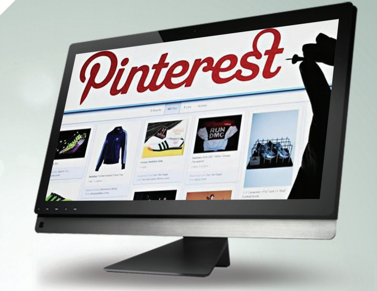
Pinterest is one of the most famous card based social media website. Pinterest is visual board. It consists of different cards which consist of different images where you can pin it, like it, send it, and edit it. Clicking on a pin or a card gives you more options to explore more aspects of the card.
Let’s take example of Airdrop function on Apple Devices
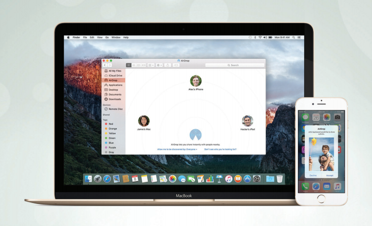
When you have any incoming data, a card pops up in the notification bar with two options embedded, i.e., “Accept” or “Decline”. With a simple click, you can accept or refuse the incoming information.
Thus, cards are the ideal way to make your design glanceable, functional, and user-friendly. The reality behind the card style feature stays more unique than web service experiences. People explore out the information quickly and briefly, and cards serve it up with perfect bite-sized teasers – disregarding of device.
Javascript is extensively used for several years ever since it was first developed. There are so many reasons in the bucket that why we need to use Javascript. Firstly, Javascript is so natural to learn and utilize. And another reason is, it has the wide accessibility to simple-to-join, open source libraries like jQuery, React.js, Backbone.js, Angular.js, and Ember.js.
To better understand of Javascript security, let’s explore in deep to outline and know why it has become the future wave in developer’s perspective
Javascript is everywhere
As we all know Javascript is incredibly powerful language. It is a high-level and interpreted programming language that has been widely used since its release. Javascript is world’s 11th most prominent programming language. It is commonly used in dynamic web pages to provide extended functionalities such as interactivity, animations, user activity, tracking and more. In order to do this, the Javascript is embedded in an HTML page, where it can interact with pages Document Object Model (DOM) to perform specific functions. In addition to its usage in web browser applications, Javascript is progressively used in mobile applications via cross-platform development tools like Titanium and PhoneGap, and in server-side code via frameworks like Node.js.
Javascript Security
Since its release, there have been several Javascript security issues that have gained outspread attention. The way javascript interacts with the DOM poses a risk for end users by enabling deleterious actors to deliver scripts over the web and run them on client computers. There are two measures that can be taken to contain this Javascript security risk. The first one is sandboxing, or running scripts separately so that they can only access certain resources and perform only specific tasks. Secondly, implementing the same origin policy, this prevents scripts from one site, accessing the data that is
Javascript is one of the most versatile and effective languages used to extend functionality in websites. However, it also possesses some negative effects that might make you think twice before implementing Javascript on your websites. Every programming language has its own advantages and disadvantages. Let us review some of its pros and cons.
Advantages :
Javascript is executed on the client side: The code is executed in the user’s processor rather in the web server, thus saving the bandwidth on the web server.
Extended functionalities to web pages: Third party ad-ons like Greasemonkey enable Javascript developers to write snippets, which can execute on desired web pages to enhance its functionality. If you are using a website and you wanted to add some certain features, you can write it by yourself and can use add-ons like Greasemonkey to implement it on the webpage.
Disadvantage:
Security Issues: Javascript snippets, once it is adjoined onto the web pages, it executes on the client server immediately and, therefore, can also be used to exploit the user’s system. While a cer tain restriction is set by modern web standards on browsers, the malicious code can be still execut ed by compiling with the restrictions set.
Javascript rendering varies: Different layout engines may render the Javascript differently, thus resulting in inconsistency in terms of functionality and interface. Though the latest versions of Java script and rendering have been regulated towards a universal standard, certain variations still exist.
Thus, the rise in the use of Javascript brings you with a great promise, but the combination of its interpreted nature and its increase use also opens the entryway to more risk. You need not to be scared off, as there is much you can do to reduce the risks for your business.
Every design tells a story. Every story has a design. It’s your job to connect the two. Effective storytelling requires that you use visual and user interface design to build something that makes the user feel compelled to keep scrolling longer than you think.
Incorporating certain web design elements makes the users engage, study, and learn about their business. It has become the ultimate weapon in communicating a message. Sometimes it becomes impossible to create a more advanced, interesting and remarkable effects when employed with new emerging technologies like HTML5 and CSS3. There are also some design trends in the market that makes web developers pay attention to these design effects, one of such effects is parallax scrolling that gives stunning and memorable websites.
Going in depth, let us see what exactly the parallax scrolling is: basically, parallax is a technique in web design where background images are moved slowly than the foreground image, thereby giving a 3D feel to a 2D plane.
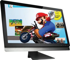
1) Mario Kart Wii, is one of the best examplesof parallax scrolling.
2) This tourism site introduces visitors to the Seattle Space Needle. It is different from a lot parallax sites. This site is both whimsical and informative and it is also a great example of how the effect can be used and it also illustrated the elements to give the illusion of depth.
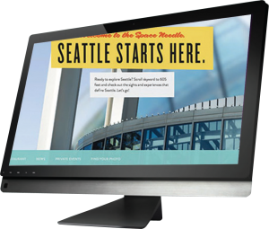
3) Another great example of parallax scrolling is,The website by Wipro uses parallax design to present data in an aesthetically pleasing and unique way. This particular site shows how the parallax scrolling effect can be used for even the most seemingly prosaic content to make it more useful and engaging for the site visitors.

Parallax can be performed in various ways:
• Raster Parallax : is used to give an optical illusion of movement.
•Repeat Pattern : it gives scrolling displays over a repeated background.
•Layered Parallax : where foreground and background images move at different pace.
Parallax technology is successful in the sphere of design because, it makes sites look innovative, modern, and cool. This effect can be implemented in plentiful ways based on the designer imagination and tastes. So what are the benefits of this technology?
First of all, parallax can liven up your website which doesn’t contain a lot of information.
The other important feature is “interactive design”, which leads to great public engagement compared to ordinary websites. It’s always better if the design looks attractive, right?
The parallax scrolling is not only used for two-dimensional effects. It can also be used for adding different effects for the page such as icon moving, icon enlargement, and minimization based on scrolling.
Every coin has two sides, though there is a wide usage of parallax over websites there are certain considerations you must target on while using parallax in your web pages.
The Loading Time:
People on the internet have less attention span and limited time: If your website fails to load fast it will lose visitors, no matter how fancy the website is designed. As per the reviews and research, parallax is not well known for its speed, and this means no matter how you implement it, you are sacrificing a Page Load Time.
Most of the sites with parallax scrolling don’t work on Mobile Devices. That’s the real another problem. Many people tried to manage this effect work on mobile devices, but they don’t give it for free.
Parallax does not go well with SEO: A parallax page site is a one-page site and this is one of the major problems when you want to optimize the site for search engines and you will lose the meta data and title tags, which are very important.
Final Verdict:
Dynamic storytelling with parallax scrolling is a perfect choice for portfolio websites, and landing pages to showcase your business at a single glance.
The most considerable thing about web designing is that it is always changing and deriving. Web designing is the Google’s new design practice; it is the mobile first approach design system. The main aim of the material design is to make everything in a same simple manner so anybody can understand them, even if it is an application with a brand new functionality.
Material design has been defined as a visual concept that works to combine science and technology with the traditional rules and principles of classic design. Material design is like a flat design, but it has more depth than other usual designs. Material design has used bolder colours, layout principles, animated elements, and better use of typography. The most important and used aspect is transitions. Material design has the best psychological traditional effects.
Many well-known companies started to adapt material design for their projects. Companies like Whatsapp, Invision and many more started using material design principle these days.
We have found some great material design based front end framework while we resource in material design, so, in this article we have put together the best material design frameworks for developers.
M-UI Design Framework:
Material UI is a lightweight CSS framework that allows Google’s Material Design guidelines. It was designed from the ground up to be fast, small, and developer friendly. The major goal of the project is to provide a basic set of components and helper methods so that developer can build the sites that are fast and user-friendly.
Material-UI components run on top of Facebook’s React.js library. Everything in the framework is a React component except the basic CSS classes for material colours and typography. This makes a little crucial for non-programmers, since one need to have a good understanding of Javascript, JSX syntax, and basic React concepts.
The framework is much customizable and you can override the style for most of the components by passing custom CSS classes as props to the components under consideration. Roboto fonts are at the crux of Material UI framework for a clean modern look and feel.
The most important goal of building MUI is that the developers can use it fastly, and consistently the UI components across platforms from web to mobile to email to iOS to Android.
Angular Material Design Framework:
An Angular material project is nothing but the implementation of Material design in Angular.js. The Angular material is a complete framework that implements Google’s material design and provides reusable, well-tested, and accessible UI components based on material design. Angular material is created and maintained by Google’s team, who has created the material design guidelines in association with Google’s Angular framework developers.
The framework in the Angular ecosystem will run on directives. All material design components are available as directives and services, the behaviour of the components can be controlled by the usage of attributes.
The developer can customize typography, colours and other components by using the theming layer of the framework.
Angular material package is available in GitHub and can also be built using npm and gulp, alternatively, you can get the distribution files and install locally using Bower.
var app = angular.module(‘StarterApp’, [‘ngMaterial’]);
app.controller(‘AppCtrl’, [‘$scope’, ‘$mdSidenav’, function($scope, $mdSidenav){
$scope.toggleSidenav = function(menuId) {
$mdSidenav(menuId).toggle();
};
}]);
“ The above code describes Angular module and Angular Controller “
Bootstrap Material Design Framework:
Definitely this one is for all the Bootstrap fans and also for the people who is planning to start a new web project. It would not be completely appropriate to call it as a framework since it is a theme built using Bootstrap 3 that implements Google’s material design.
It comes packed with components and CSS compliant with some material guidelines and so customizable that you can create any layout and obtain any design just by making minor configuration changes.
Bootstrap is the best framework for creating responsive websites at lightning speed and material design is the design philosophy that is fuming at the moment.
You get Bootstrap elements plunged in material design, these includes tabs, navigation bars, typography, buttons, progress bars, sliders, and panels.
Bootstrap is definitely a go without a second thought if you are among the people who do not believe in building websites from scratch.
Final Thought
Material design is raging in the present environment and the whole web and mobile ecosystems are undergoing a mass scale redesign influenced by Google’s material design principles. Frameworks around any new design paradigm are necessary and that is what we are witnessing here with material design.
Let us see how these frameworks shape up and where the web goes from here with material design in near future.
You can return the response from an Async call in two ways:
1)using callback
ajax(“/echo/json”).then(function(result) {.. }
2) promise
function foo(callback) {
$.ajax({…success: callback(result)
});
}
function myCallback(result) {
// Code that depends on ‘result’
};
foo(myCallback);
Sass (the preprocessor) allows two different syntaxes: SCSS (a CSS-like syntax) and Sass (indented syntax).
The new main syntax is “SCSS”, is a superset of CSS3’s syntax. This means that every valid CSS3 stylesheet is valid SCSS as well. SCSS files use the extension .scss
Sass, the older syntax indented syntax is intended for people who prefer conciseness over similarity to CSS. Instead of brackets and semicolons, it uses the indentation of lines to specify blocks. Files in the indented syntax use the extension .sass
Call attaches this into function and executes the function immediately. We need to list the arguments one-by-one (comma separated): person.hello.call(person, “world”);
Apply is similar to call except that it takes an array-like object instead of listing the arguments out one at a time:person.hello.apply(person, [ar1,ar2…]);
Bind attaches this into function and it needs to be invoked separately like this:var helloFunc = person.hello.bind(person);helloFunc(“world”);