Scope Inheritance in Angular JS

Scope Inheritance in Angular JS

In Angular, a scope is associated to an element, while an element is not necessarily directly associated with a scope. It is important to have a solid understanding of prototypical inheritance and differentiate the types of scopes. A child scope normally (prototypically) inherits from its parent scope, but not always. Scope inheritance is also normally straightforward, until 2-way data binding is required (i.e., ng- model) in the child scope. In that case, the child scope gets its own property that hides/shadows the parent property of the same name.

There are four types of scopes. The first one has “normal prototypical scope inheritance”; ng- include, ng-switch, ng-controller – create new scopes and inherit prototypically ( note that, ng- controller, however, is considered bad form for two controllers to share information via “scope inheritance.”), directive with scope: true. If more than one directive (on the same DOM element) requests a new scope, only one new child scope is created. Since we have “normal” prototypal inheritance, you want to be wary of 2-way data binding to parent scope primitives, and child scope hiding/shadowing of parent scope properties.

The second type has “normal prototypal scope inheritance with a cop y/assignment” – ng-repeat. Each item/ iteration of ng-repeat creates a new child scope, and that new child scope always gets a new property. Changing the child scope property’s value does not change the array the parent scope references.

The third type of scope and the one exception to the rule of inheritance is an “isolate scope” (created by directive with scope: {…}. Note, also, that, by default, directives do not create new scopes i.e., the default is scope: false so there is no inheritance there. Default is not a good choice for writing directives that are intended as reusable components.) An “isolate scope” is not prototypical but ‘=’, ‘@’, and ‘&’ provide a mechanism to access parent scope properties, via attributes. The object hash is used to set up two-way binding (using ‘=’) or one-way binding (using ‘@’) between the parent scope and the isolate scope. There is also ‘&’ to bind to parent scope expressions. So, these all create local scope properties that are derived from the parent scope. This construct is often the best choice when creating a “reusable component” directive, since the directive cannot accidentally read or modify the parent scope.

Scope Inheritance in Angular JS

The last type is a “transcluded scope”- directive with transclude: true. The directive creates a new “transcluded” child scope, which prototypically inherits from the parent scope. The transcluded and the isolated scope are siblings – the $parent property of each scope references the same parent scope.

It’s important to remember that for all scopes (prototypal or not), Angular always tracks a parent- child relationship (i.e., a hierarchy), via properties $parent and $$ childHead and $$childTail.

In the case of a more complex scope inheritance, your workarounds should include three basic steps: 1) define objects in the parent for your mode, then reference a property of that object in the child: parentObj.someProp, 2) use $parent.parentScopeP roperty (where possible), and 3) define a function on the parent scope, and call it from the child.

jQuery to AngularJS Paradigm Switch

jQuery to AngularJS Paradigm Switch

It’s March 2015 and the AngularJS is hotter than ever. According to our statistics alone 60% of developers are adopting the Google brain child. Hiring rate in AngularJS has gone up to 42% in 2015, compared with 13% in 2012.  Now before you start your relationship with this beautiful client-side framework, you want to understand its peculiarities to see if you’d want to spend hours on end playing with it. Let’s say that you’re an active jQuery developer and you’d like to switch to AngularJS – you’re wondering what it’d be like.

Well, the first thing you have to have in mind is that AngularJS and jQuery are pretty much like apples and oranges. They do different things and adopt different ideologies. Technically speaking, jQuery is a library and AngularJS is a framework. In the community, there isn’t even a common word to describe them together- library, platform, framework? There is definitely a common ground here; it’s just not on the surface. Let’s dive deeper into this.

AngularJS provides you with a set of features to produce a web applications, while jQuery mainly gives the ease of DOM manipulation and AJAX. With jQuery you instruct the DOM about what needs to happen step by step. With AngularJS you describe what end result you’d like to see but not how to do it. And here comes first piece of advice : In AngularJS you have to start from the ground up with your architecture in mind. Start with your objective, then move to designing your application flow, followed by data design and then finalize by designing your view for presentation. Your kind of need to plan out the whole project, you can’t just add AngularJS on top. Basically, don’t augment jQuery with AngularJS. If you observe keenly, we planned out to create Data Objects (Models), Behavior and Flow of Application (Controller) and Presentation (View) – making us think in terms of MVC – that’s what AngularJS is mainly about.

(Note: You could rewrite/inject a jQuery plugin in AngularJS but don’t make it your primary solution or you’ll never master AngularJS.)

Ok, so now you know that you need to operate like a server-side developer in addition to thinking like a client-side developer. Now you have to think about how to divide your application into individual, testable components.

Angular allows you to separate/isolate the DOM manipulation in the directives(directives can be considered extensions of HTML – in case HTML doesn’t do something you need.

These directives tell the AngularJS HTML compiler how to behave and what to do (attaching event listeners and interactions). And that is a key differentiator of the framework. If you want, you can create your own custom directives that will contain all your view logic or DOM manipulation. In contrast, jQuery says very little about how you should organize your code. It is you who have to tell the DOM what to do. Let’s break it down:

In jQuery, we programmatically change the view by responding to events and then updating them. AngularJS, on the other hand, will automatically update (synchronize) your view so you don’t have to. The view here is the “official record” of view-based functionality. So outside of a directive (applied in the view) you never need change the DOM.

Let’s repeat again:
Only do DOM manipulation in a directive.

However, in AngularJS there is a separate model layer that is independent from the view that we can manage how we want. Your model represents(or holds) your data and is tied to a view via scopes. Views therefore are a projection of the model. You can create HTML templates for each view, using the directives.

EXAMPLE
Angular.module(“mySampleApp”,[])
.directive(“paymentform”,function(){
return{
restrict: “E”,
templateUrl: “partials/paymentForm.tmpl.html”
}
});

AngularJS also uses directives and controllers (your controller’s function is to initialize $scope) to remove certain behaviors from HTML.

EXAMPLE (CONTROLLERS)

Angular.module(“mySampleApp”,[])
.controller(“paymentCtrl”,function($scope, payFactoryModel){
$scope.title = “Payment Methods”;
payFactoryModel.initiatePayment();
}

When looking for a comprehensive all-in-one solution, many tech enthusiasts realized that AngularJS is the right choice between the two. Its two-way data binding, in-built directives and filters has allowed developers to build applications very rapidly and has made them think about Angular.js as a viable replacement to jQuery.

Responsive web design VS Mobile application

Responsive web design VS Mobile application

Responsive web design in Mobile ApplicationThe trend of accessing content on tablets and Smartphones has revolutionized many users to shift from desktop to mobile devices. Their digital way of accessing services and products has become inevitable. This has led developers to develop two approaches to mobile-ready web design: Responsive websites and Mobile websites.
A responsive website is a website that can adapt itself on various screens-sizes regardless of the devices that you use it. Responsive websites are usually optimized for viewing on mobile phones, tablets and desktops. Hence, the Responsive Web Design approach eliminates the need for developing a separate website for every mobile device platform. This method of designing is now preferred by web designers and developers as it covers a large number of users’ devices.

Mobile website is a website created significantly for small-screen devices. Similar to a regular website, mobile websites can also be accessed through various browsers. A mobile website generally consists of limited content and hence it is light-weighted and faster when compared to regular websites. If a browser is using a mobile phone to view a website, then the website automatically detects that the website has accessed on a mobile phone and then it redirects the browser to a separate URL to view the mobile specific website.

Mobile applications are the applications developed mainly for mobile device platforms such as iPhone, Android, Google, etc. Usually, mobile applications have been downloaded from app stores. There are a large number of mobile applications available for various platforms. As there are many mobile phones available with various operating systems, mobile applications are incredibly expensive to develop and maintain. If you want to provide users a mobile experience that engrosses speedy decisions and also selling and buying, then you need to have a separate mobile website.

If you want to constantly add something or update your website based on new trends, then having a single responsive web design is the best option. When thinking about the advantages of using responsive websites, first thing that comes to our mind is the download activities that are not required for responsive websites whereas the mobile applications require you to download them from app stores. Also, a responsive website doesn’t require you to update any information again and again. You just need to update the information on your main website that makes your work done.

Responsive websites provides you the compatibility across various platforms. It enables the content updates in the websites driven by Content Management Systems. The main disadvantage of using a responsive website is that the responsive website cannot be used without an internet connection while the mobile applications support this situation. Comparing the development cost, both responsive websites and mobile applications entail a strong budget. As a responsive website is entirely composed of complicated codes and technicalities, it requires a huge development cost. However, a mobile website requires a very low development charges. When considering the optimization process and SEO, responsive website takes up the priority than the mobile websites.

Optimize Mix and match typography in web design

Optimize Mix and Match Typography in Web Design

Mix and Match Typography in Web Design
Technology advancements has popularized a typography style in websites. The ability of selecting the appropriate font has broaden to the extreme to make websites attractive. Mix and Match typography has become the necessary features of web design for creating the best user experience. To improve the website look and feel in long run, selecting the right typographic plays the key role to leave viewers attractive. After years of working, many customers are focusing and pushing designers to go with mix and match typography style of usage in their websites.

With emergence of new trends popping up for better readability, there is raise in usage of usage of typography in web design. Most notably, retro typography on vintage style websites is quiet powerful across the web. This trend has been around for a while but now we are seeing this in full force for websites who want to set up their brand in bold and visually interesting ways. This Mix and Match typography relies on the designer’s ability to choose the right fonts to match not just the message, but the other typographic styles in use.

Some designers usually stick to one font to what they like, but it is good to mix and match fonts with the flow of website without effecting the overall look. Think of not to use too-small or too loopy fonts that are hard to read and look for long periods of time. Though there are several kinds of fonts available, look for the right mix and match typography that fits the mood and aesthetic of your design. Try out new things to achieve a desired effect for your website allowing viewers with maximum readability.

Benefits of using new Frameworks-LESS and Sass

Benefits of using new Frameworks-LESS and Sass

Benefits of using new Frameworks-LESS, Sass

There are numerous CSS frameworks that are used to develop web applications such as Sass and LESS. They are both CSS based frameworks but the complexity of app handled by these frameworks are different. Each of these frameworks is suited for different web app development. Here I have provided a brief introduction between these frameworks and its features.

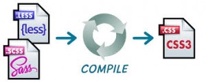
Sass is an extension of CSS3, adding nested rules, variables, mixins, selector inheritance, and more. It’s translated to well-formatted, standard CSS using the command line tool or a web-framework plugin. Sass has two syntaxes. The older syntax, called “the indented syntax” uses a syntax similar to Haml. It makes use of indentation to separate code blocks and newline characters to separate rules. The newer syntax, “SCSS” uses block formatting like that of CSS. It uses curly brackets to denote code blocks and semicolons to separate lines within a block. The indented syntax and SCSS files are generally given the extensions .sass and .scss respectively. Both these syntaxes are fully supported – there is no functional difference between them.

Features of Sass:

  • Fully CSS3-compatible
  • Language extensions such as variables, nesting, and mixins
  • Many useful functions for manipulating colors and other values
  • Advanced features like control directives for libraries
  • Well-formatted, customizable output
  • Firebug integration
  • Syntax

SASS is an excellent scripting language for web app development. But using it with frameworks makes web development even easier and enjoyable. One great thing about SASS is it has built in CSS color math. One can automatically change the color of the menu and the hover state manually. Another great way to use SASS is you can organize all of your CSS into a single file. It simply adds more power and better organizational tools, making it an easy choice as a go-to replacement.

LESS is a dynamic style sheet language that allows developers to reuse CSS elements and write LESS code with the same semantics. The LESS compiler is written in JavaScript, so you can just include it in your page along with your LESS stylesheet. It has everything that CSS is missing like Variables, Mixins, Nested rules, Operators and functions, Namespaces for grouping variables and mixins etc.

The similarity between these SCSS and LESS frameworks is its features and functions. But they slightly differ in syntax. They make web app development easier for the programmers and facilitate them to create intriguing web applications. SASS is only accessible to Ruby/Rails environments, while LessCSS can be used by anyone, with any languages, or just plain HTML website. For developers adopting these frameworks, it is essential to understand the paradigm shift these frameworks bring to client side application development.

USER INTERFACE FRAMEWORKS

User Interface Frameworks

Most of the high class web applications that normally we see on the web depend on a delicate set of UI libraries, controls and frameworks. The Web UI is basically an HTML, CSS, and Javascript based application that is used to construct and manage the server appliance from a remote client. In order to build a consistent and reliable UI (User Interface), you need to extend your Web UI. There are several types of UI frameworks available in multiple languages, in the market. These frameworks are used to create the user interfaces to turn up the desired task quickly. But it is important to choose the right web UI framework for the project to develop more flexible and error free applications.

Frameworks often help speed up the development process by providing necessary functionality that is “out of the box”. This includes things such as user and role management, data access, caching, and much more. These frameworks help you simplify the more important details of design and stays focused on project management by alleviating the need to reinvent the wheel for common development needs. For development of web applications, there is a need of technologies all at once – HTML, CSS and JavaScript for the presentation purpose and there are others such as PHP, Java, and .NET that handle more of the dynamic aspects of the application.

There are UI frameworks that often help speed up the development process by providing necessary functionality used in web applications, web sites, web desktops, widgets, modal dialogs, standalone windows and much more to name. JavaScript UI framework is one of the basic component that is used by most applications for buttons, tabs, menus, trees, and dialogs, etc. On the other hand, there are rich and well organized widgets that control the web 2.0 applications by using the Prototype JavaScript Framework.

There are various integrated set of tools to enable developers to develop user interfaces for different types of web applications. Normally, these tools include an XML markup language, cross-platform library, JavaScript runtime, data binding engine, page compiler, runtime inspector, control library, animation engine, cross-platform library, Ajax as well as back button support. These frameworks add the value based features in different websites and web application development process. Most of them will have unique features specific to that particular framework in terms of platform compatibility, portability, database compatibility, general performance, security, web services and language support etc. and are suitable for key development functions. So before diving in, it’s necessary to have an idea of the most commonly used frameworks that can significantly result in more secure applications.

USERINTERFACE

User Interace

User Interface refers to the aspects of hardware or software which can be seen by the human user, and the commands and mechanisms the user uses to control its operation and input data. While User Interface Design is often used for computer systems, it is the part of any system exposed to a user. As per a research survey, it is found that many people are facing problems with poorly designed websites. Some of their problems include vision problems, level of discomfort, and stress at work. So in this article, I would like to highlight why good user interface design is important and discuss the consequences of poor design.

Good user interface design is important because, the need for the design and development of user interfaces that support the tasks people want to do has become an important issue. Users are more comfortable with computer systems that are easy to use, easy to understand, and enable them to attain their goals with minimum frustration. Good user interfaces can lead to benefits such as higher staff productivity, lower staff turnover, higher staff morale, and higher job satisfaction. Economically, these benefits should translate into lower operating costs. Bad user interfaces, on the other hand, may result in stress and unhappiness among staff, leading to high staff turnover, reduced productivity, and, consequently, financial losses for the organizations.

As presentation of web design have much to do with the success of any company. It is important to come up with a user friendly approach to get better results and attract the targeted audience. So considering reliable human factors is of great importance to the organizations during the website design and development, otherwise you may also lose the chances of driving traffic to your site which would eventually affect your business performance. So streamlining your website by following the human factors is a great way to improve the performance.

There are three factors that should be considered for the design of a successful user interface websites; development factors, visibility factors and acceptance factors. Here is the list of things that must be taken into consideration: human abilities, clear conceptual model, navigation, page layout, typography, headings, links, text appearance, color and texture, images, animation, audio and video effects etc. By taking care of these characteristics, organizations can effectively design good interface design, thereby reducing costs, employee turnover, and increasing user satisfaction, productivity, and quality services.