Dynamic Storytelling with Parallax Scrolling
Every design tells a story. Every story has a design. It’s your job to connect the two. Effective storytelling requires that you use visual and user interface design to build something that makes the user feel compelled to keep scrolling longer than you think.
Incorporating certain web design elements makes the users engage, study, and learn about their business. It has become the ultimate weapon in communicating a message. Sometimes it becomes impossible to create a more advanced, interesting and remarkable effects when employed with new emerging technologies like HTML5 and CSS3. There are also some design trends in the market that makes web developers pay attention to these design effects, one of such effects is parallax scrolling that gives stunning and memorable websites.
Going in depth, let us see what exactly the parallax scrolling is: basically, parallax is a technique in web design where background images are moved slowly than the foreground image, thereby giving a 3D feel to a 2D plane.
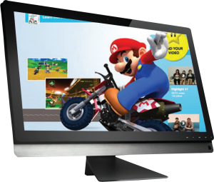
1) Mario Kart Wii, is one of the best examplesof parallax scrolling.

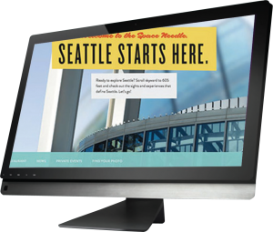
2) This tourism site introduces visitors to the Seattle Space Needle. It is different from a lot parallax sites. This site is both whimsical and informative and it is also a great example of how the effect can be used and it also illustrated the elements to give the illusion of depth.

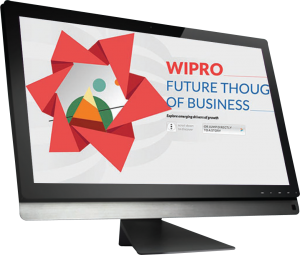
3) Another great example of parallax scrolling is,The website by Wipro uses parallax design to present data in an aesthetically pleasing and unique way. This particular site shows how the parallax scrolling effect can be used for even the most seemingly prosaic content to make it more useful and engaging for the site visitors.

Parallax can be performed in various ways:
• Raster Parallax : is used to give an optical illusion of movement.
•Repeat Pattern : it gives scrolling displays over a repeated background.
•Layered Parallax : where foreground and background images move at different pace.
Parallax technology is successful in the sphere of design because, it makes sites look innovative, modern, and cool. This effect can be implemented in plentiful ways based on the designer imagination and tastes. So what are the benefits of this technology?
First of all, parallax can liven up your website which doesn’t contain a lot of information.
The other important feature is “interactive design”, which leads to great public engagement compared to ordinary websites. It’s always better if the design looks attractive, right?
The parallax scrolling is not only used for two-dimensional effects. It can also be used for adding different effects for the page such as icon moving, icon enlargement, and minimization based on scrolling.
Every coin has two sides, though there is a wide usage of parallax over websites there are certain considerations you must target on while using parallax in your web pages.
The Loading Time:
People on the internet have less attention span and limited time: If your website fails to load fast it will lose visitors, no matter how fancy the website is designed. As per the reviews and research, parallax is not well known for its speed, and this means no matter how you implement it, you are sacrificing a Page Load Time.
Most of the sites with parallax scrolling don’t work on Mobile Devices. That’s the real another problem. Many people tried to manage this effect work on mobile devices, but they don’t give it for free.
Parallax does not go well with SEO: A parallax page site is a one-page site and this is one of the major problems when you want to optimize the site for search engines and you will lose the meta data and title tags, which are very important.
Final Verdict:
Dynamic storytelling with parallax scrolling is a perfect choice for portfolio websites, and landing pages to showcase your business at a single glance.

