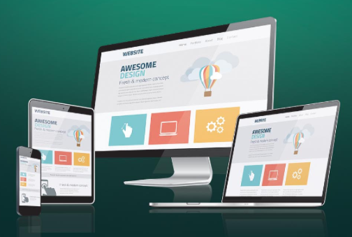
Top five suggestions for mobile friendly website
In the past few years’ mobile design has been detonated, but knowing what to do and where to start can be a big task. Mobile website design is not just about choosing between a mobile website or an application but, there is a range of options in between and aspects to take into account, including responsive web design, mobile-friendly web fonts, and much more.
To help you out, we have segregated together top tips on what to be considered while defining your mobile strategy and designing for mobile. So let’s dive deep-in and see the top suggestions for the mobile friendly website.

USE A RESPONSIVE DESIGN
Responsive design allows the website developers to create a website which is effortlessly viewable on different size devices. This reduces the amount of work the website developers have to do when it comes to creating a website.
The responsive design approach makes use of flexible layouts, flexible images, and cascading stylesheet media queries. When responsive design is used on a website, the web page will be able to detect the user’s screen size and orientation and can change the layout accordingly.
ALWAYS INCLUDE A VIEWPORT META TAG
The viewport is a virtual area used by the browser rendering engine to determine how the content is scaled and sized. Without this viewport, your website will not work perfectly on a mobile device. What the viewport meta tag tells your browser is that the page needs to get fitted into the screen. There are many different configurations that you can specify your viewport to control. Here’s what we recommend in using at the head of the document.
Note: This only needs to be declared once.
FONT SIZES AND BUTTON SIZES ARE ALWAYS MATTERS
Your font size and button sizes always matter a lot for mobile devices. For font size, it should be at least 14px. This may seem big, but instead of users to zoom-in to read the web content, make it easier for them by adjusting the font size for maximum readability. The only time the user should be choosing a smaller to a minimum of 12px, is on labels or forms.
As for buttons, the bigger the button, the better—it reduces the chances that the user will miss or hit the wrong button by mistake. For instance, Apple’s design guidelines recommend button sizes to be at least 44px by 44px. Following these guidelines will help to maximize the user’s experience on their mobile device and increase conversions for e-commerce sites.
USE HIGH-RESOLUTION IMAGES
High-resolution images are very important in responsive websites to ensure the user’s experience in a high standard. The latest models of iOS devices have high-definition screens which requires an image double the resolution of a desktop. Having extremely high-resolution images will help the developers to avoid in having pixelated or even blurry images when viewed on a retina-quality screen.
NEVER STOP TESTING
Once you’ve created your responsive website, test it for a multiple number of times. We don’t just mean “try it on one of your mobile devices multiple times;” test it on an iPhone, an Android, a Windows phone, and on different tablets. Test every page, user action, buttons; and while you’re testing, it’s always important to put yourself in the position of the user, or ask someone who didn’t design it to test it for you.
We hope these tips has provided you the guidance in knowing how to make your website mobile-friendly.


